| ♥ 0 |
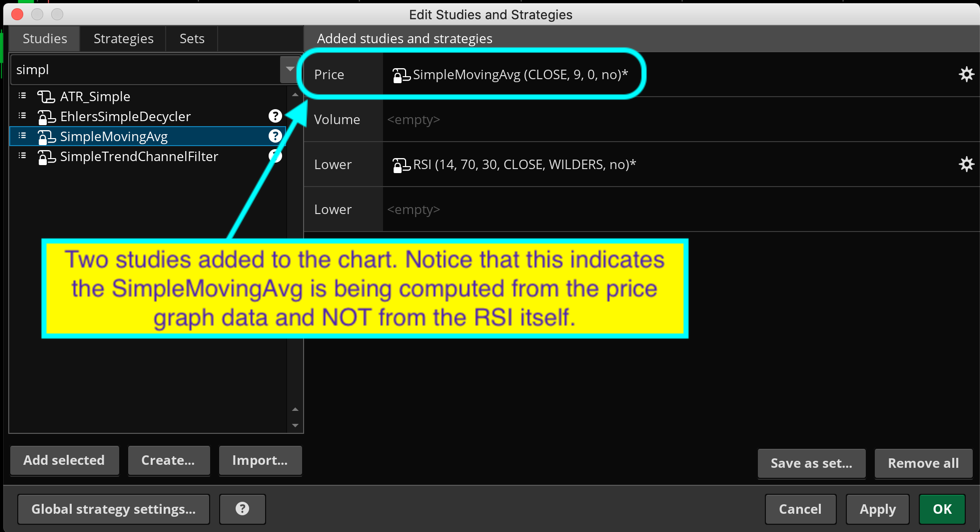
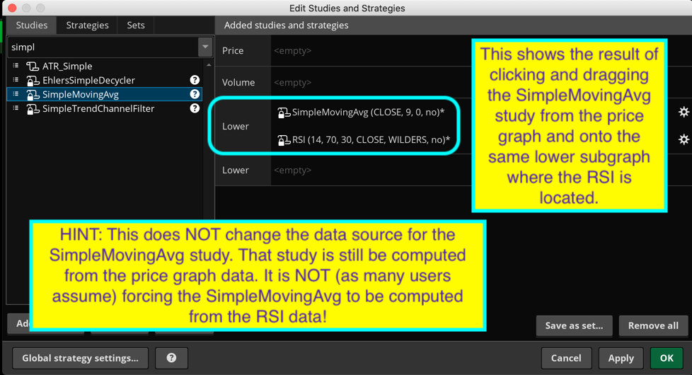
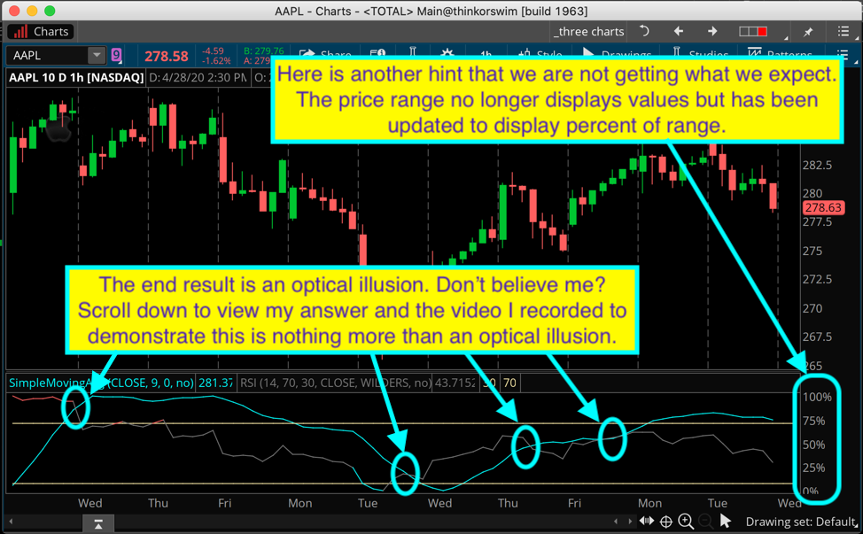
Problem: You can overlay two chart studies so they display on the same lower subgraph. However you cannot use the crossovers that appear on the chart to generate any signals or alerts. This is a very common request so I decied to add this to the FAQ’s. Here is just one example of the requests I see: “Hi Pete, I would like to have a custom chart study that plots arrows with audible alert when the RSI crosses above or below the 9 period SMA”. Along with this the person making the request provides a screenshot showing they have added RSI and SimpleMovingAvg studies to a chart. After which they take the SimpleMovingAvg study and click-and-drag it onto the RSI lower study. I have inlcuded some screenshots showing each step in the process as well as the end result. Scroll down past the screenshots to view my reponse.
Attachments:
Marked as spam
|
|
Private answer
Prepare yourself for "disillusionment" (you can google that if it's a new word for you) In order to demostrate that those crossover points are an optical illusion I have recorded a very brief video. The video contains no audio and only lasts 43 seconds. The screenshots above show how to set this up so you can follow along. One of things you want to notice in the video is that the drawing object cannot be added to the lower subgraph. This should be one of the clues that something is terribly wrong. As the video begins, take note of each crossover point. Then watch those crossover points move. Link to video: https://drive.google.com/open?id=1uZrH6VmhCp5Fko1Ey6wPCmYt8R8J-4mp If you create a custom chart study that computes the simple moving average directly from the RSI instead of the price graph data you will find it produces reliable crossover points that actually exist and indeed can be use to generate signals and alerts. Here is some code that you can actually use. The exact opposite of an "overlay":
Place this on a chart below the overlay version shown in the screenshots above and try it out for yourself just as I show in the video. This one is real, the overlay does not even exist in space and time. Marked as spam
Answered on April 28, 2020 2:22 pm
|