Ok, let’s handle the simplest one first. The chart bubbles are plotted from the very last line of code in the indicator:
AddChartBubble(alertSignal, if alertType > 0 then high else low, selectDirection, color.WHITE, if alertType > 0 then yes else no);
You delete the line entirely, or mark it out as a comment by placing a ‘#’ at the start of the line.
Without the chart bubbles, you will definitely want to have different paint bar colors for each of the two signals. The problem is you cannot get the paint bars to work properly when two different studies are trying to paint bars at the same time. They run each other over. So you only get one or the other. The best solution is to reconfigure the code to do both signals within the same indicator.
I have attached a new Study file named “Chart_MACD_RSI_modSTUDY.ts”
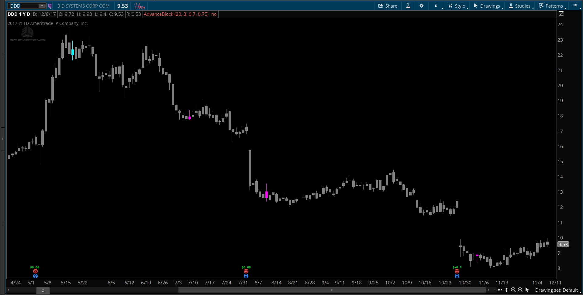
Also attached is a screenshot showing what it looks like on a chart.
The colors cannot be adjusted through settings. You will need to update the code if you want to change the colors. This is the line of the code that colors the candles:
AssignPriceColor( if signalOS then Color.MAGENTA else if signalOB then Color.CYAN else color.GRAY );

